JEWELRY EXPANSION AGENCYAIDE
AIDE is a strategic brand focused on supporting entrepreneurs and businesses in their growth. The identity was developed to communicate direction, clarity and steady progress.
-
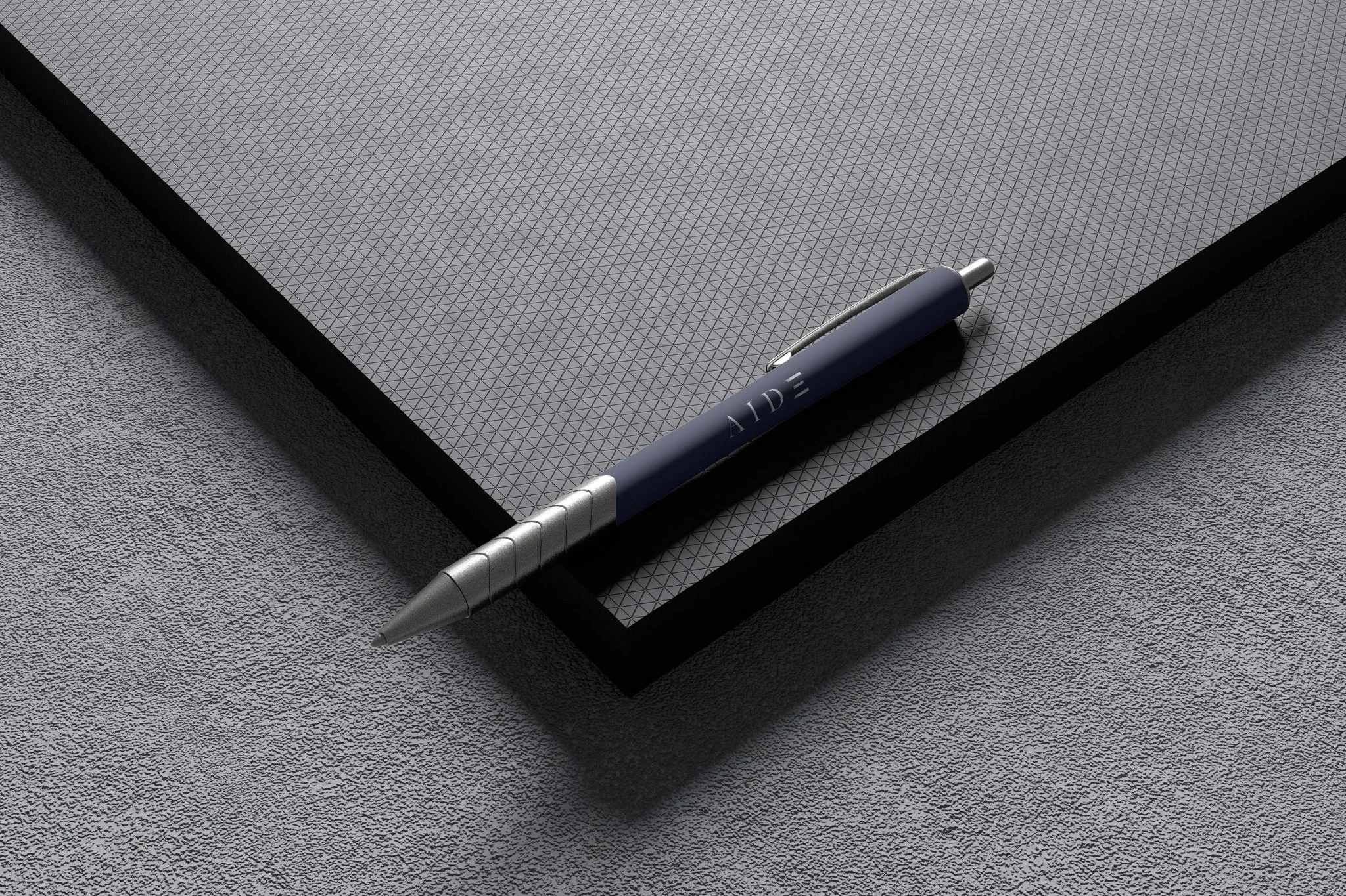
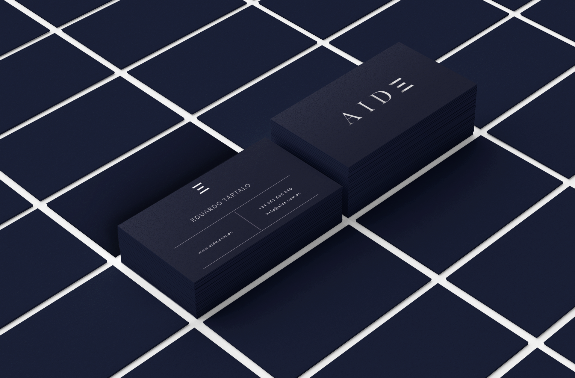
LOGO
The logo is built around a clean wordmark with a distinctive, structured detail. The stylized “E” introduces a subtle sense of forward movement, reflecting growth and upward direction without relying on obvious symbols.
-
COLOR PALETTE
The color palette centers on deep navy and metallic silver. Navy establishes stability and authority, while silver introduces contrast and a sense of precision. Together, they create a composed and professional visual language.
-
TYPOGRAPHY
Typography and layout follow a structured, modern approach. Clear hierarchy, balanced spacing and geometric letterforms ensure consistency across digital platforms and corporate materials.