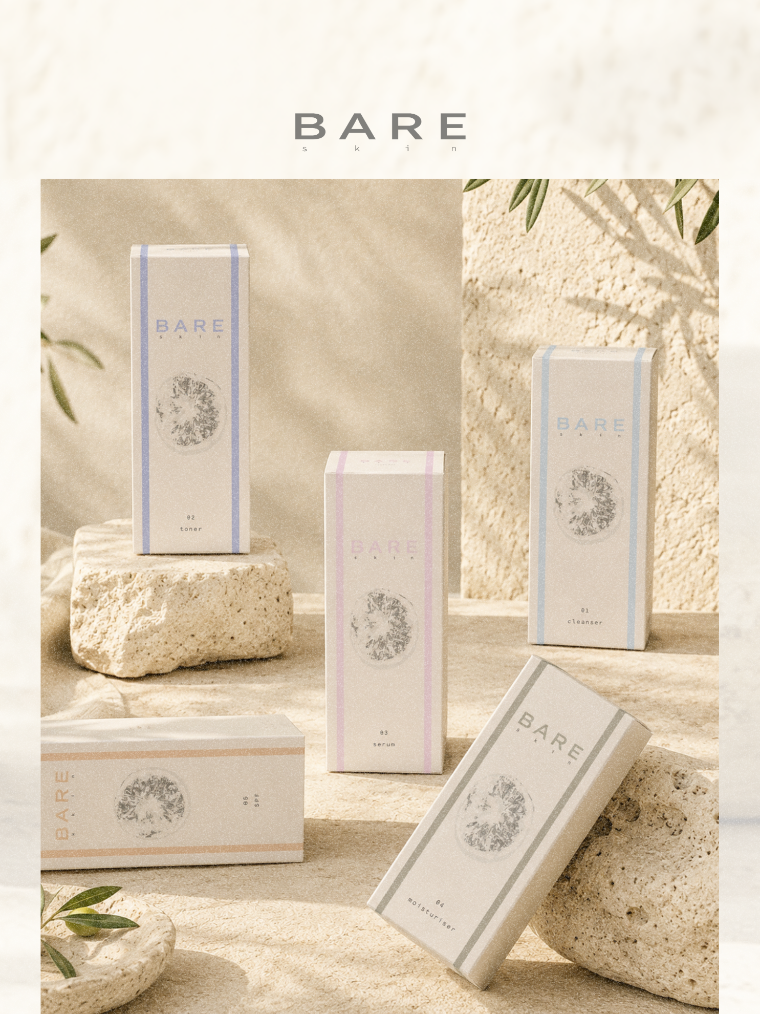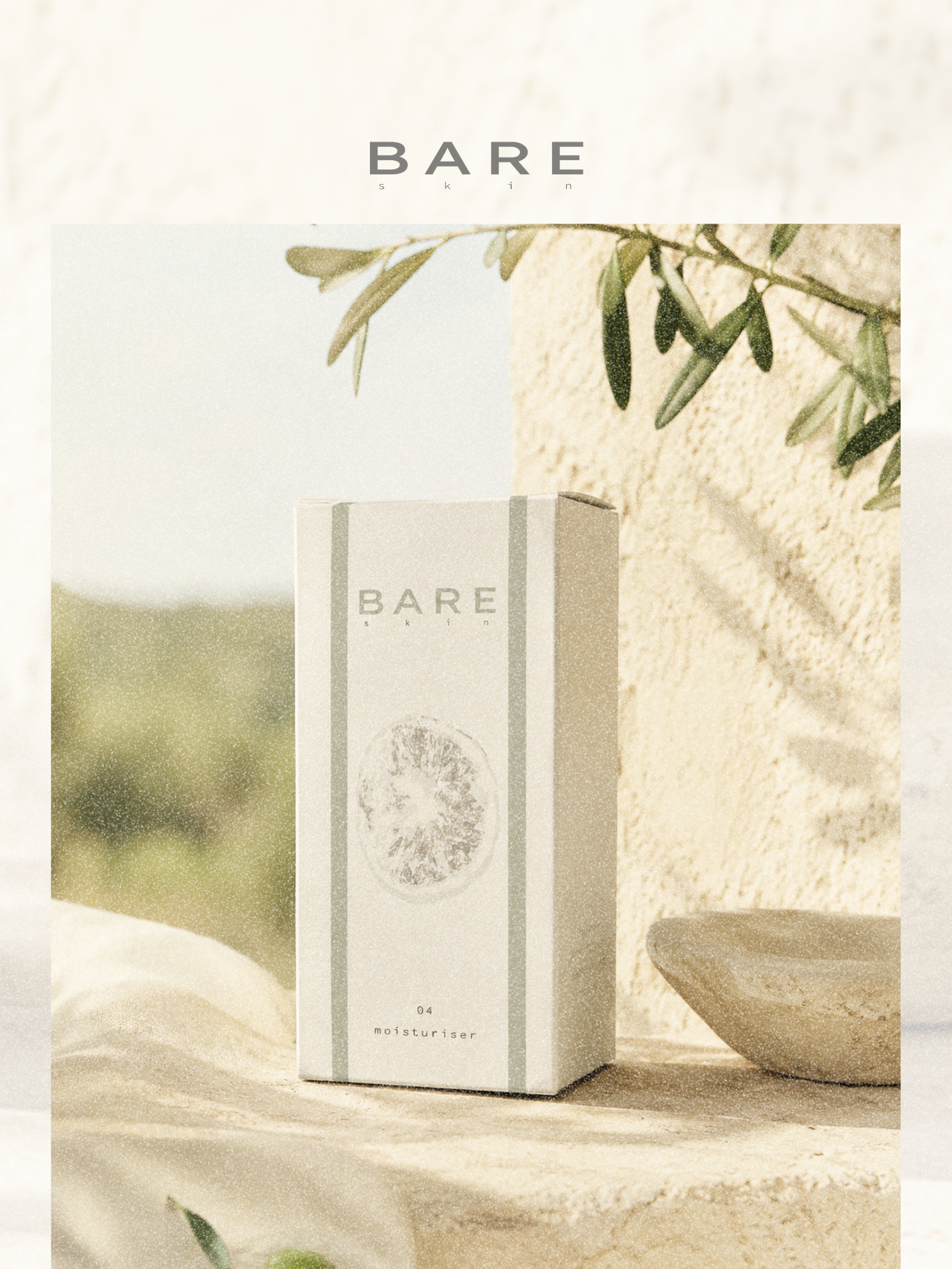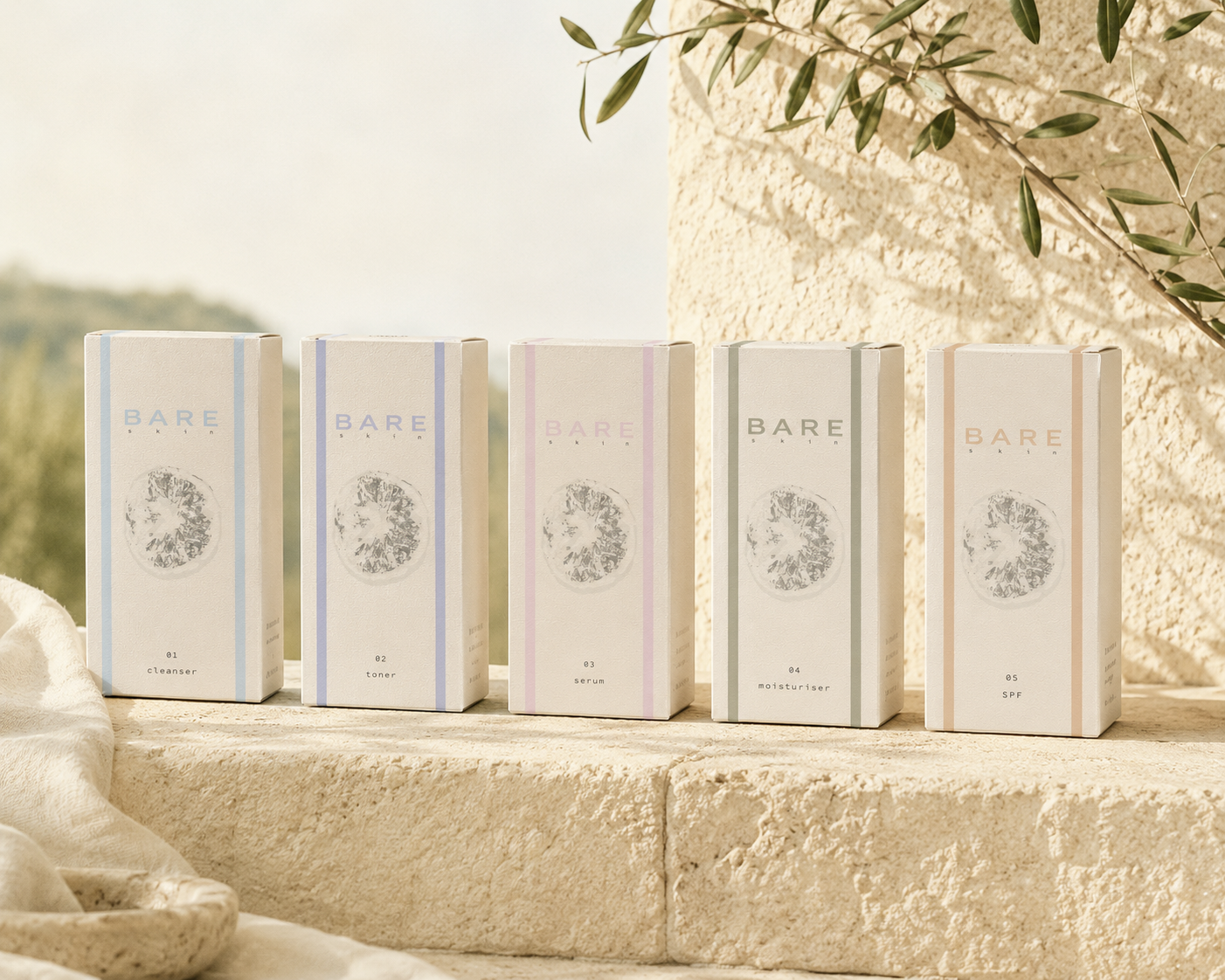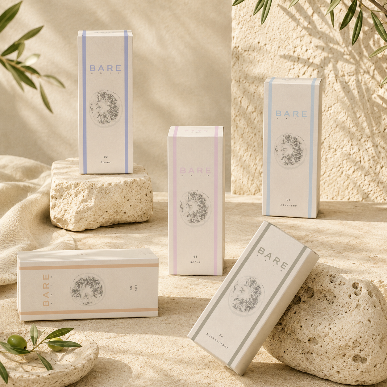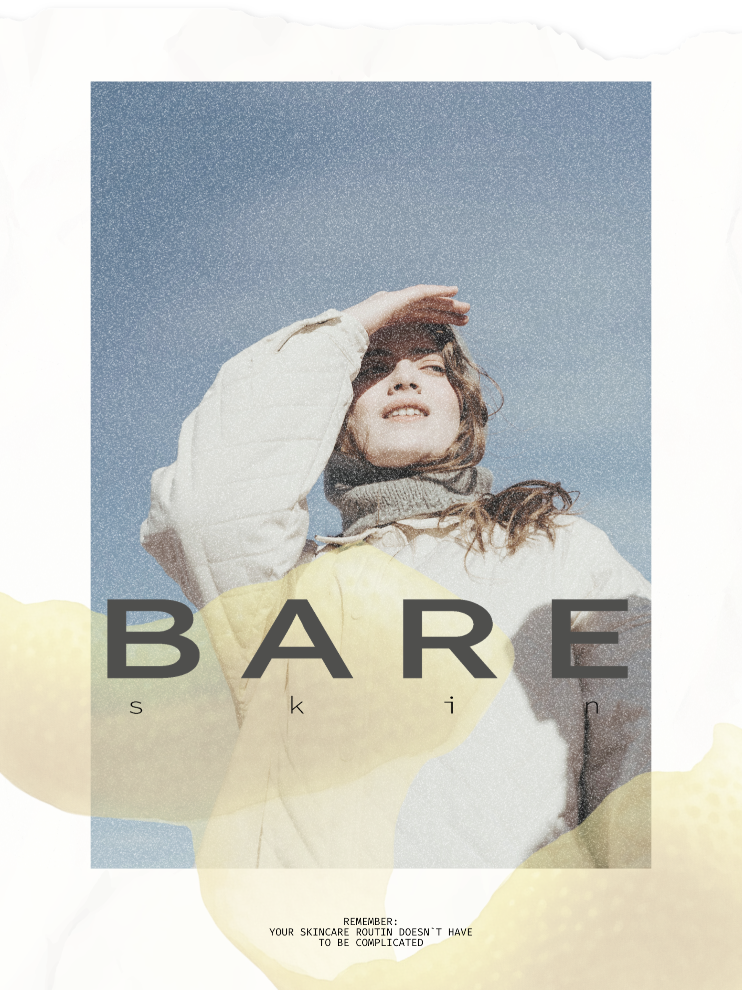
minimalist skincareBARE SKIN
BARE skin is a minimalist skincare brand concept, where the identity was developed to reduce visual noise and express softness, clarity of a simplified daily ritual.
-
LOGO
The logo is built around wide letter spacing and a soft, minimal wordmark. Its restrained structure reflects the brand’s core idea of simplicity, creating a calm and effortless presence that feels refined without becoming overly decorative.
-
COLOR PALETTE
The color palette combines stone beige, muted lemon and soft grey tones. Inspired by Mediterranean light, citrus textures and natural stone, the palette creates a warm yet minimal visual atmosphere that feels clean, gentle and quietly luxurious.
-
TYPOGRAPHY
Typography and layout follow a reduced and intentional system. Clean sans serif letterforms, generous spacing and structured composition support the brand’s calm visual language, allowing the products, textures and concept to feel clear, balanced.