MOUSSEUM
Rebranding | Brand Identity
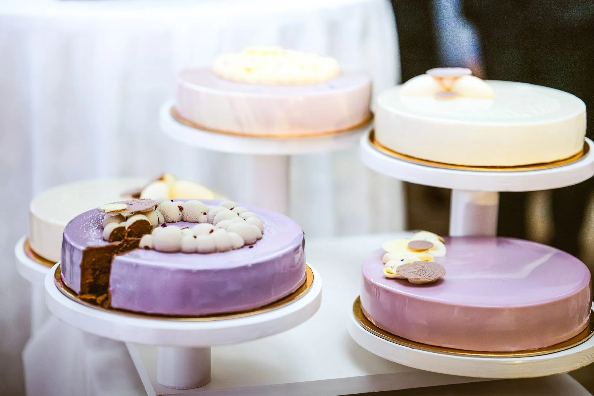
Mousseum is a contemporary dessert atelier that redefines mousse cakes through the harmony of French elegance and Hungarian craftsmanship. The brand identity captures this dual essence, refined yet approachable, luxurious yet rooted in authenticity.
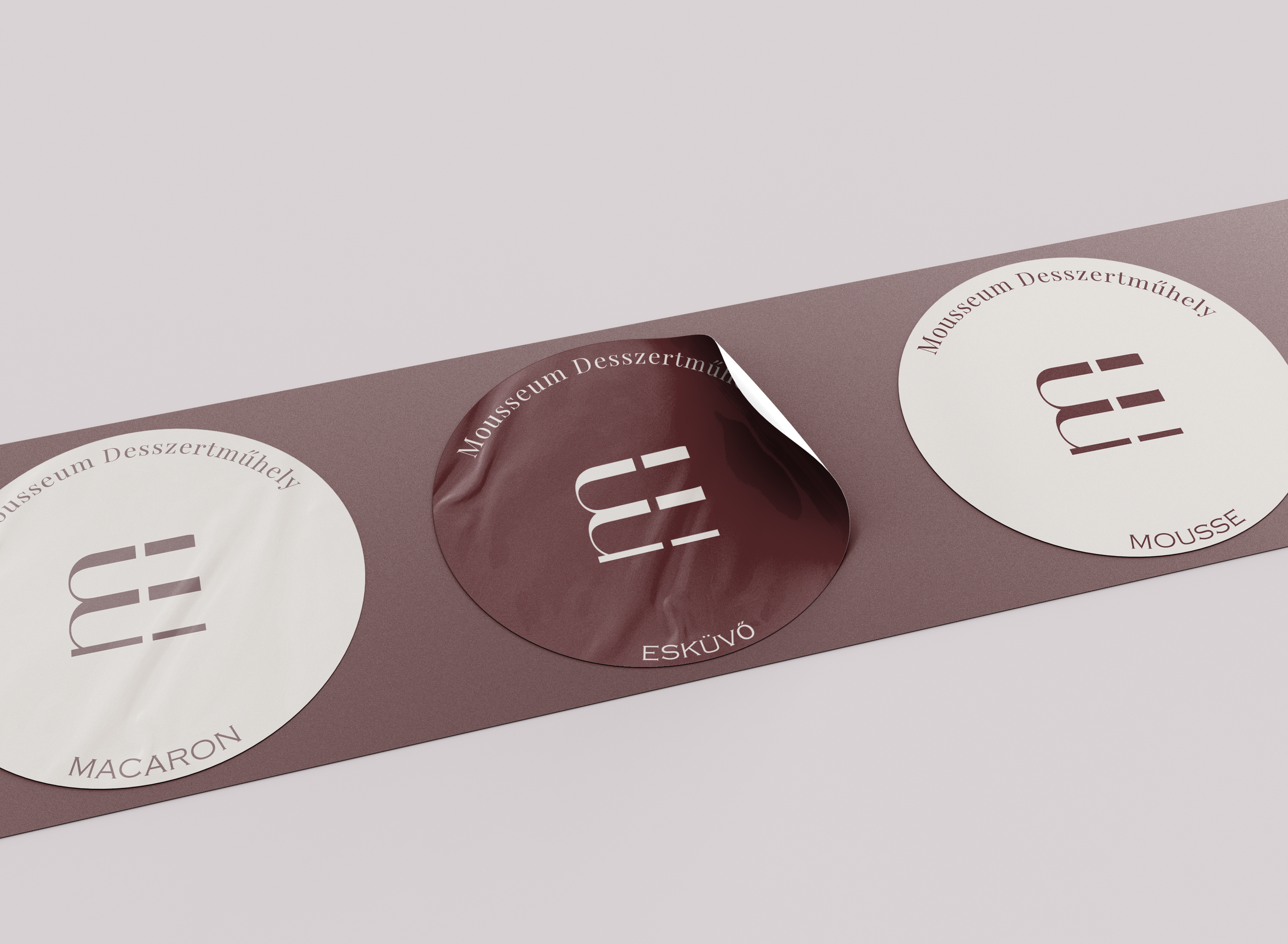
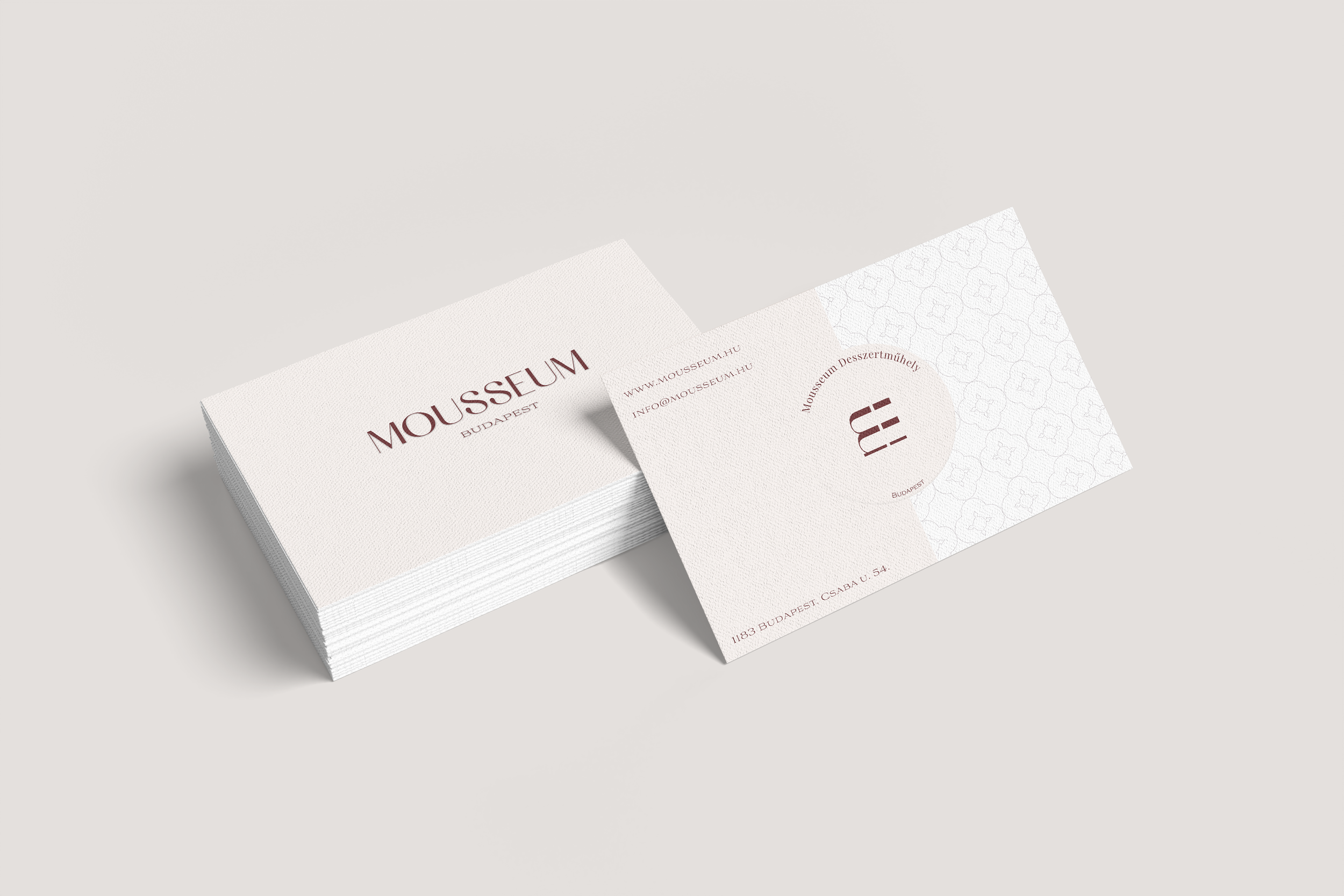
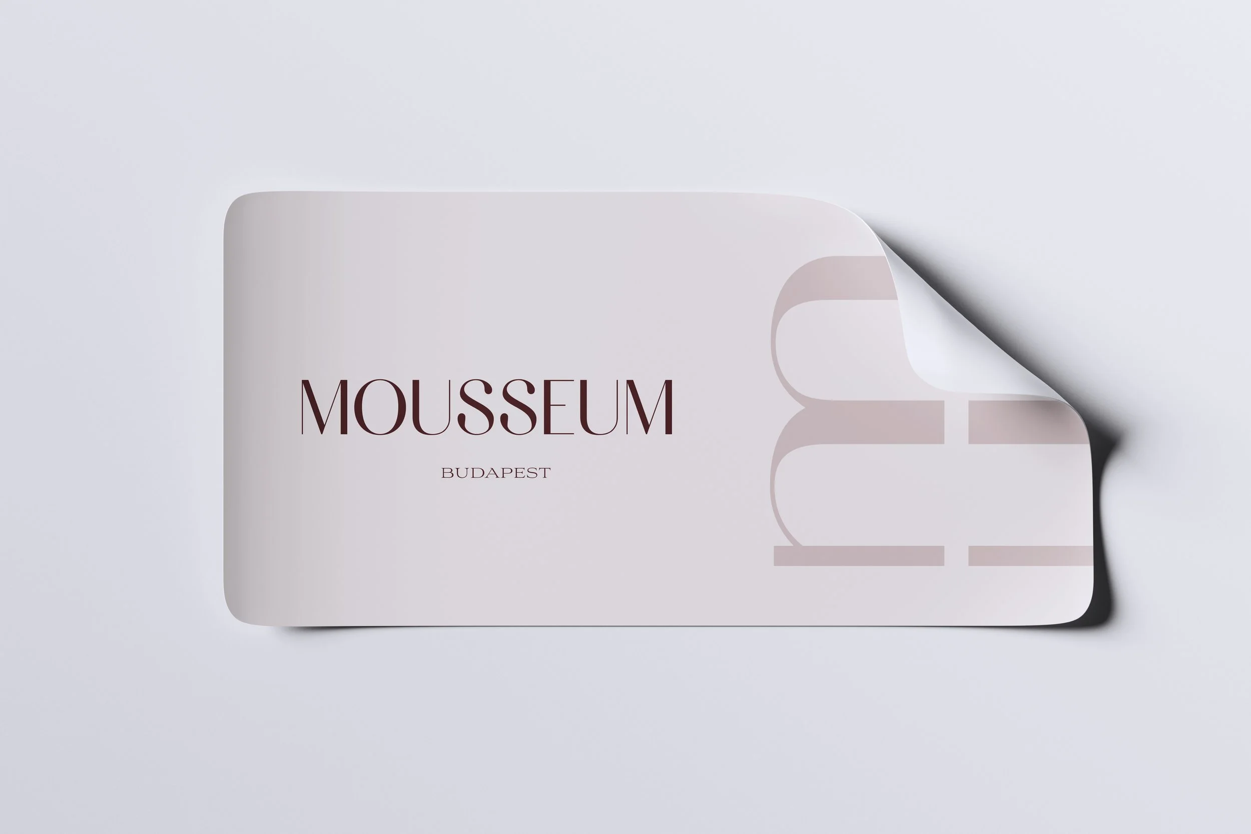
The logo features elegant, geometric typography that mirrors the precision of pastry artistry. Its minimal form gives prominence to the product itself, embodying Mousseum’s core philosophy: quality, simplicity, and taste above all.
The color palette draws inspiration from the sensory experience of desserts. Deep Bordeaux conveys richness and indulgence, Soft Beige suggests cream and light textures, while Warm Hazelnut and Mauve tones evoke praline, berries, and fine patisserie details. Together, they create a visual language that feels both tasteful and sophisticated.
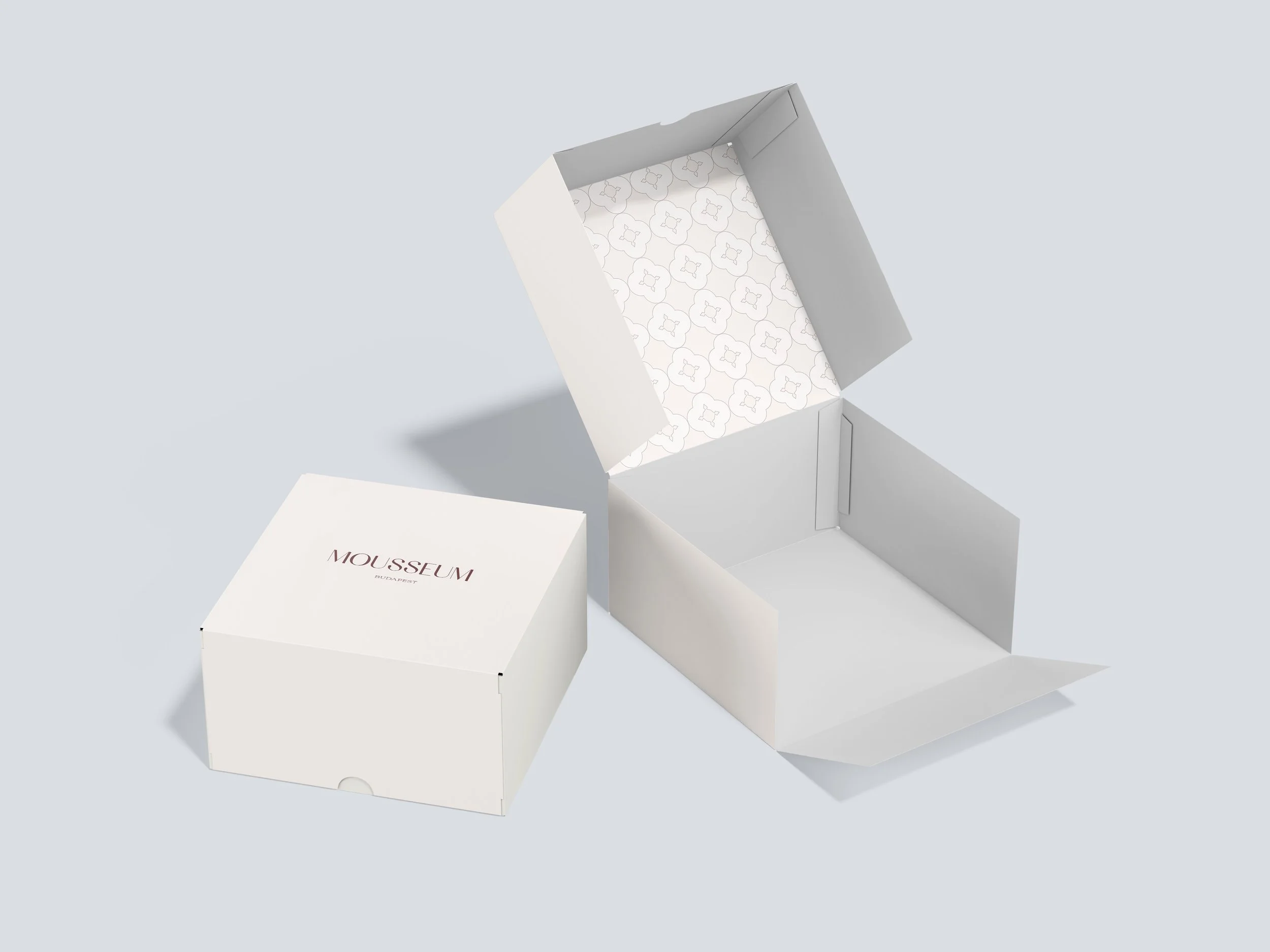
Typography and layout rely on generous white space and subtle refinement, evoking calm and trust, much like the atmosphere of a modern dessert boutique. Every touchpoint, from packaging and labels to menus and social media presence, reflects the brand’s commitment to a premium yet minimal experience.
Core elements:
– Refined geometric wordmark emphasizing precision and artistry
– Dessert-inspired color palette (Bordeaux, Beige, Mauve, Hazelnut)
– Clean, balanced typography and layout structure
– Cohesive packaging and print design reflecting modern patisserie elegance
The result is a cohesive, elevated brand identity that transforms Mousseum into more than a dessert shop, a sensorial experience defined by craftsmanship, beauty, and flavor.