luxury jewelry houseISABELLA DEL FLEIRE
Isabella Del Fleire is a luxury jewelry house inspired by European artistry and modern femininity. The brand was developed to express elegance, precision and quiet confidence.
-
LOGO
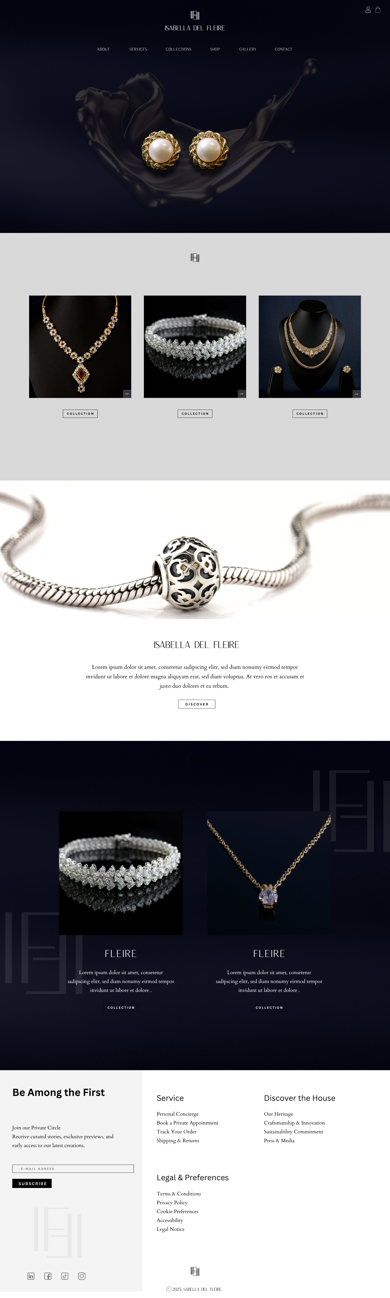
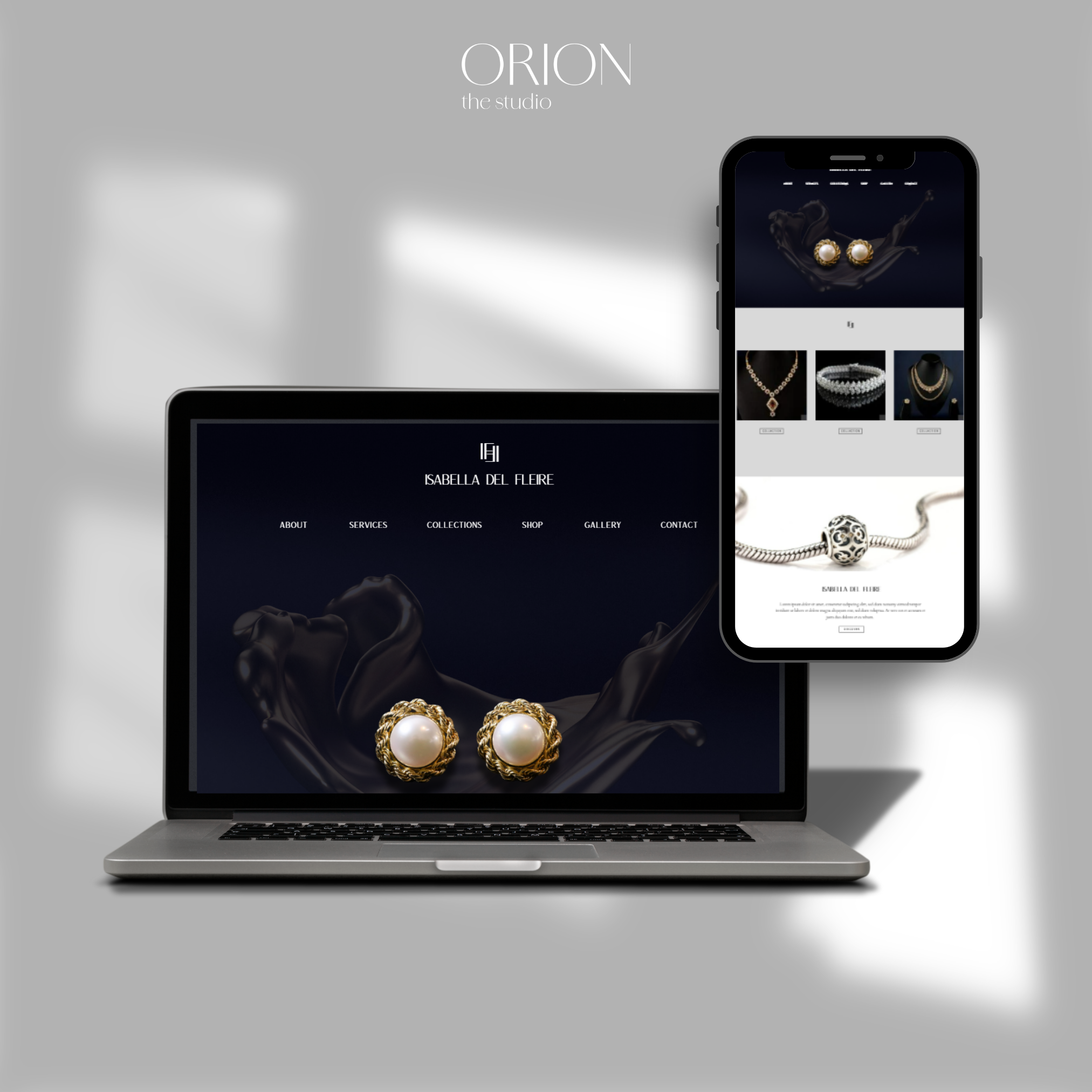
The logo is built around a monogram system influenced by classic jewelry houses. Its balanced proportions and subtle detailing create a sense of heritage while maintaining clarity and control.
-
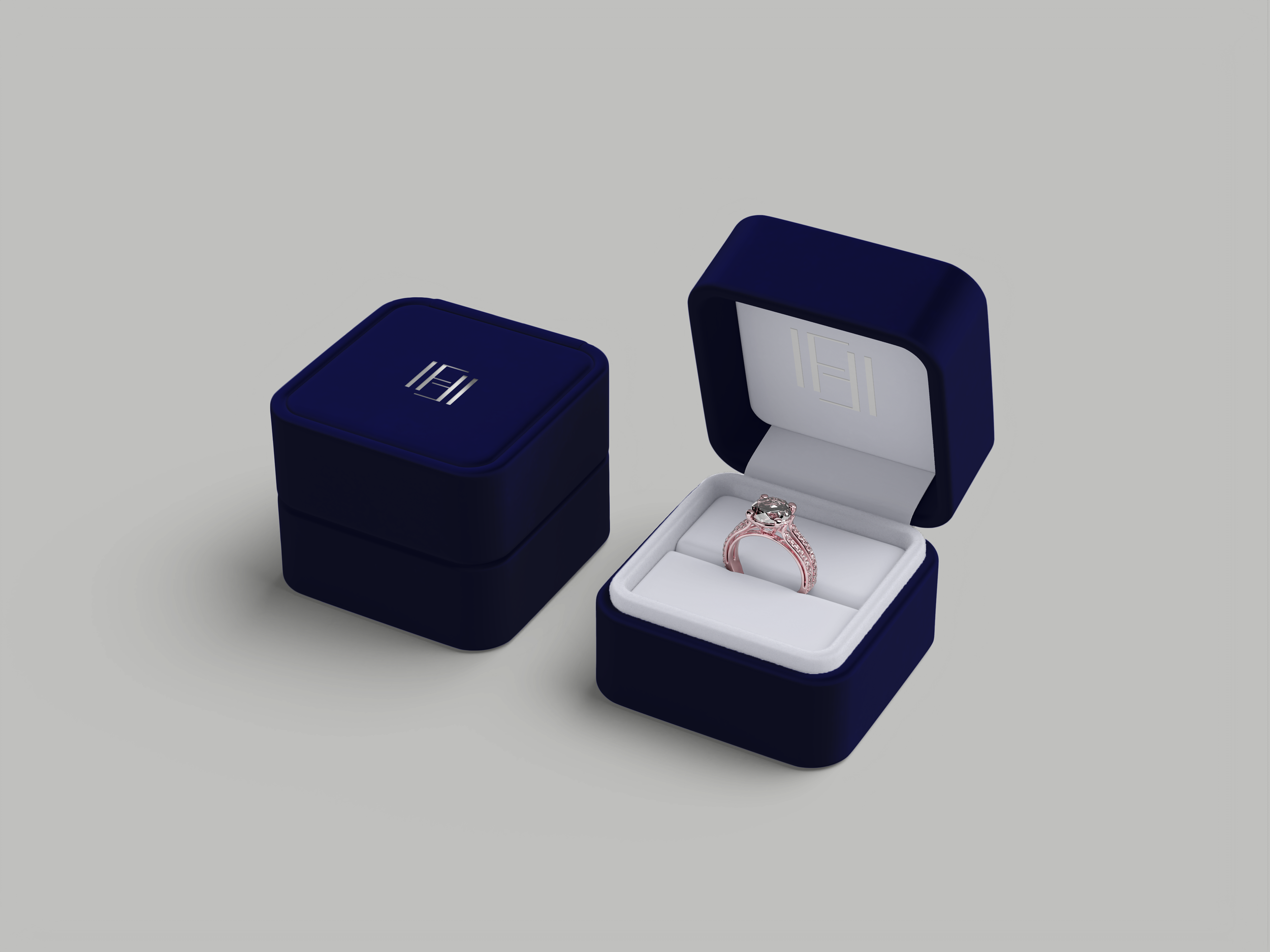
COLOR PALETTE
The color palette centers on deep navy, pearl white and soft metallic gold. Navy adds depth and presence, pearl tones introduce lightness, and gold accents provide contrast without excess. Together, they create a composed and recognizable visual language.
-
TYPOGRAPHY
Typography and layout follow a structured approach with generous spacing and clear hierarchy. Serif letterforms reference tradition, while clean composition ensures readability across packaging, digital platforms and print.