Hanna’s Beauty
Brand Identity | Logo Design
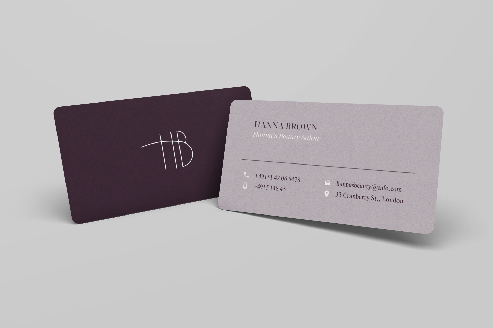
Hanna’s Beauty is a modern beauty salon concept defined by elegance, precision, and calm sophistication. The brand identity was created to reflect confidence and refinement, with visuals that capture the timeless allure of effortless beauty.
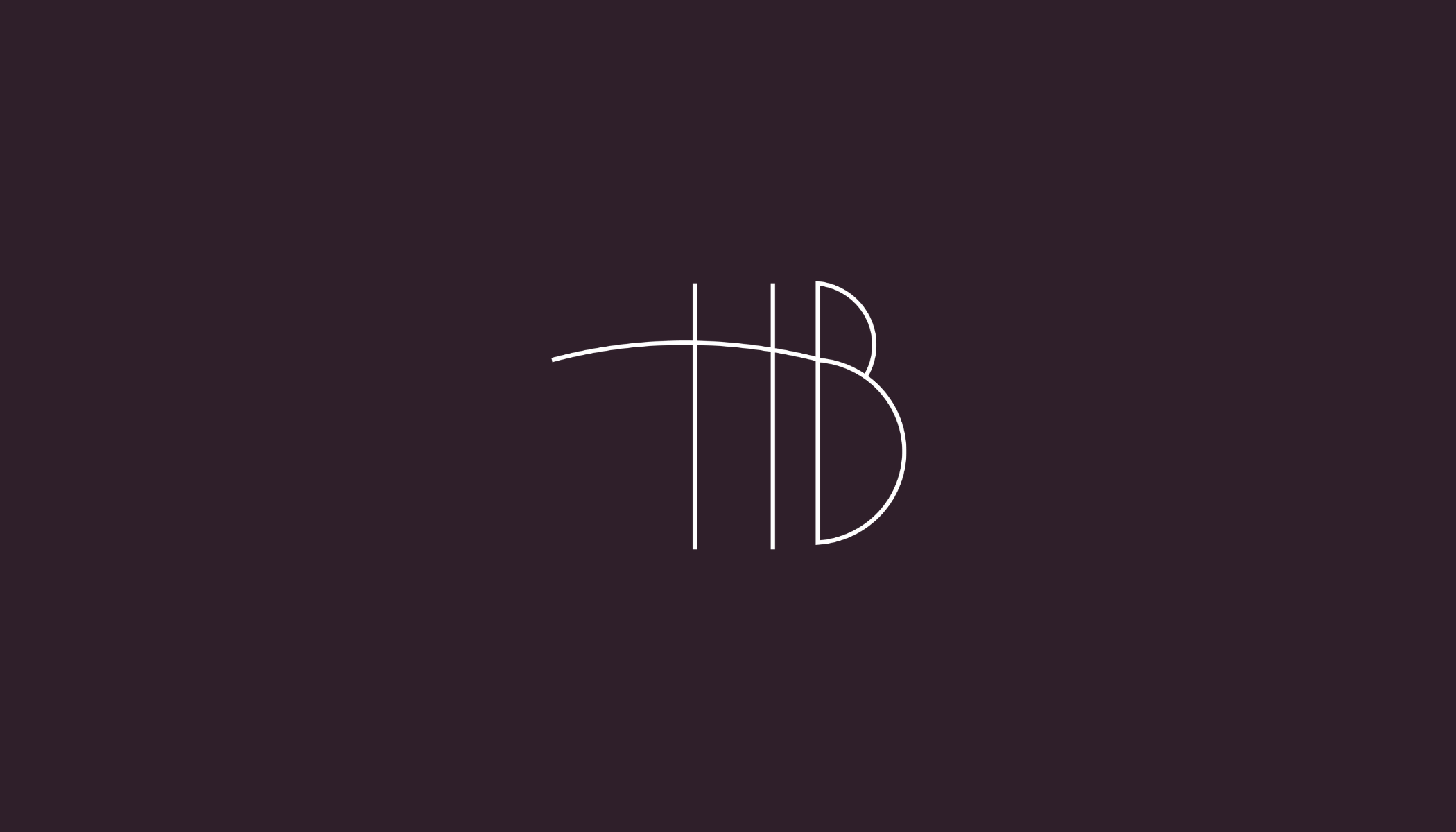
The logo concept merges the initials “H” and “B” into a single, flowing monogram — symbolizing balance, connection, and the artistry behind every detail. Its fine lines convey delicacy and modern femininity, while the overall composition remains minimal and confident.
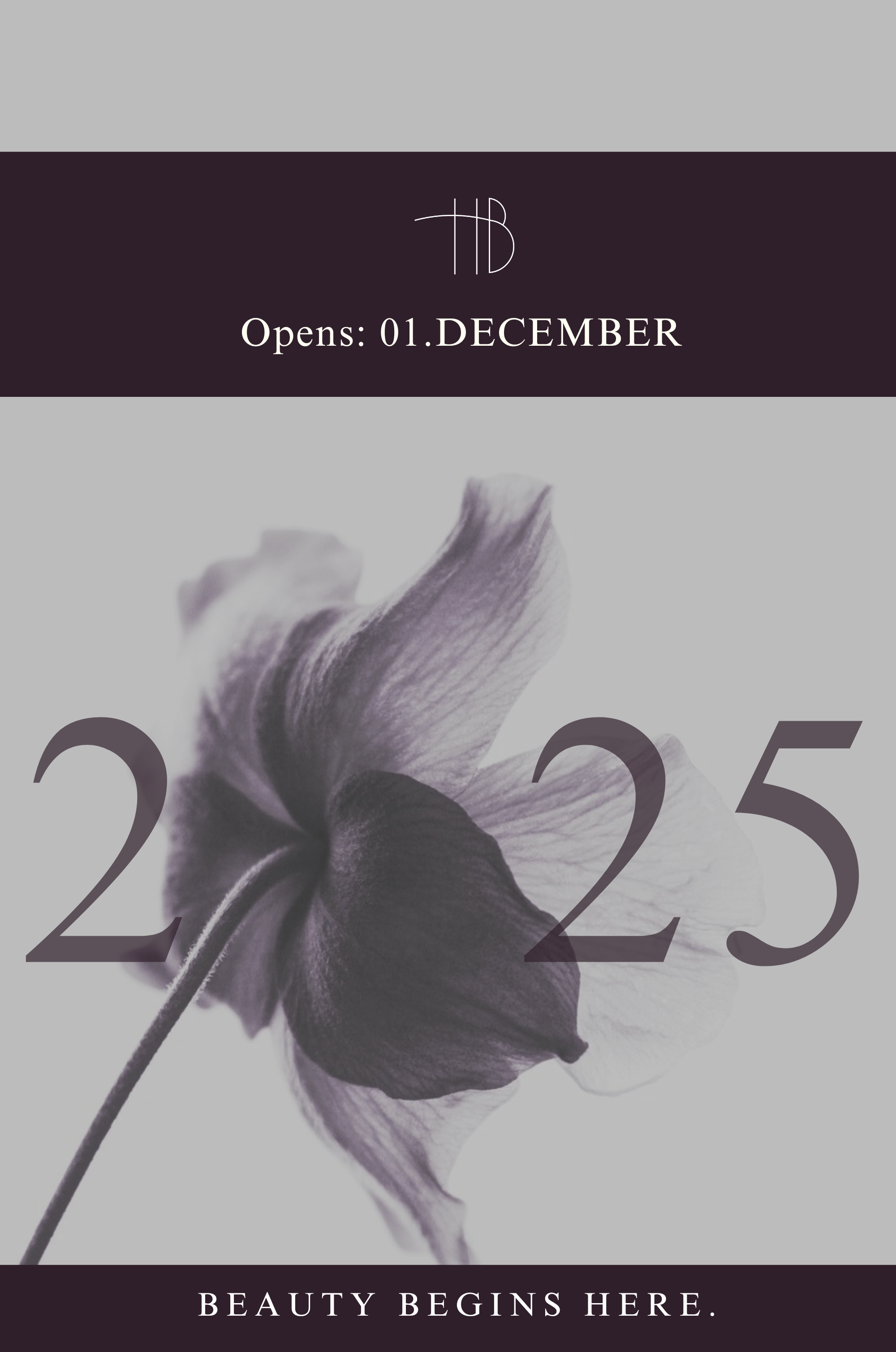
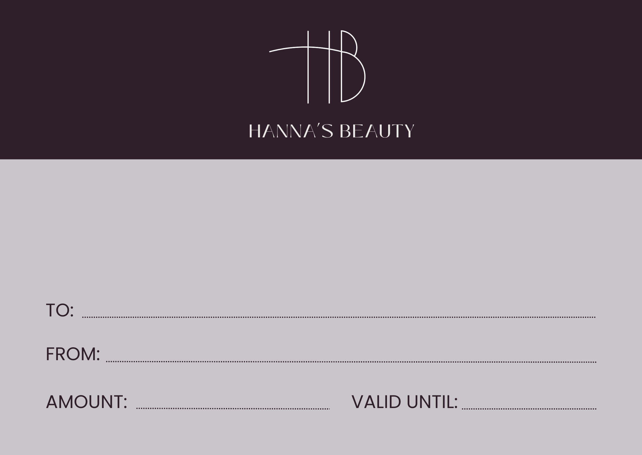
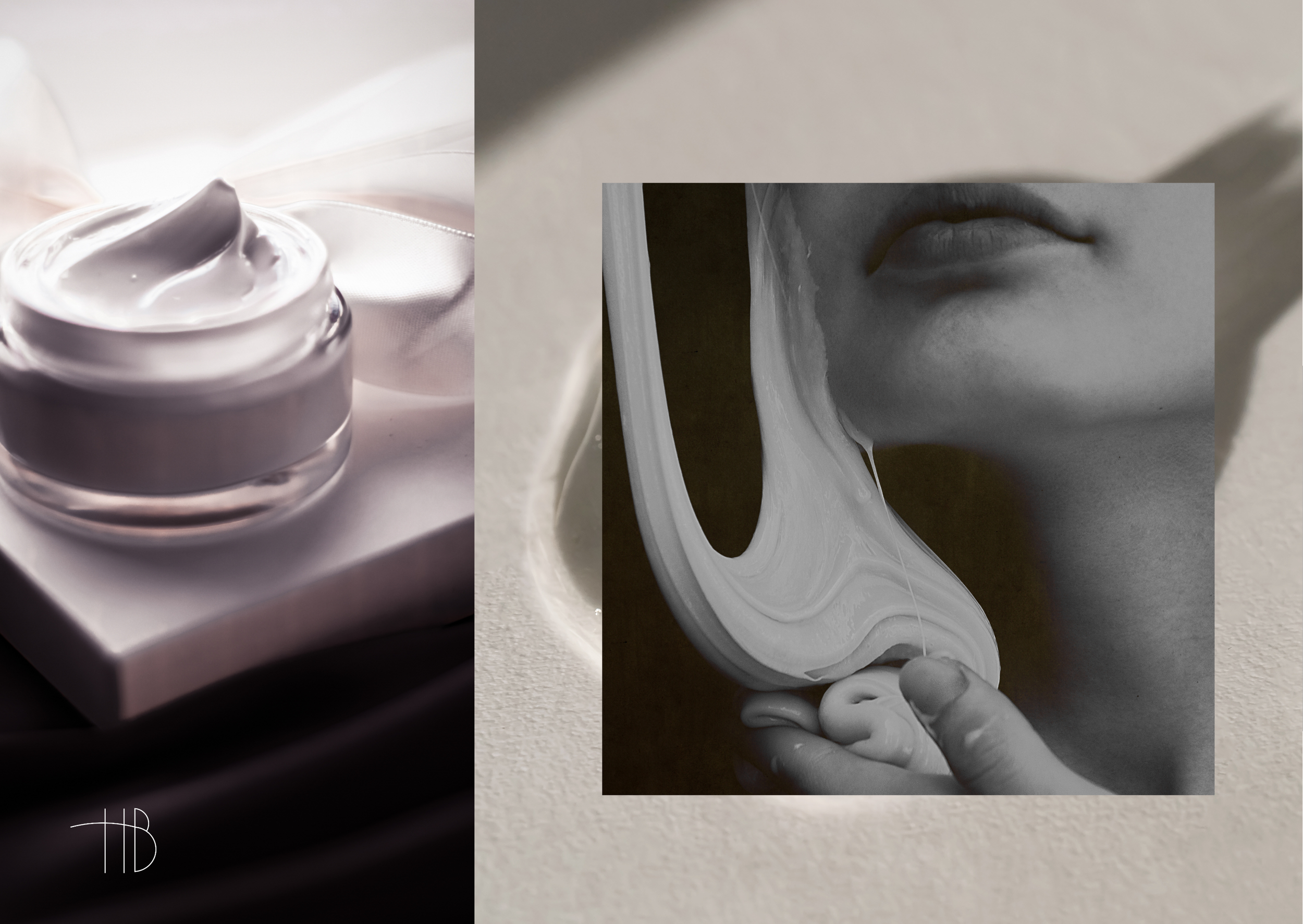
Typography and color palette emphasize harmony and understated luxury. Deep plum tones combined with soft lilac shades create an atmosphere of intimacy and warmth, while the serif typography adds a classic, professional touch. The identity extends seamlessly across business cards, packaging, and digital materials, ensuring a cohesive, elevated presence.
Core elements:
– Elegant monogram combining “H” and “B”
– Minimal yet expressive visual system
– Deep plum and muted lilac color palette
– Timeless serif typography with a refined tone
The result is a sophisticated and feminine identity that perfectly mirrors Hanna’s Beauty’s philosophy — enhancing natural elegance through expert care and thoughtful design.