OASIS Spa
Brand Identity | Visual Campaign

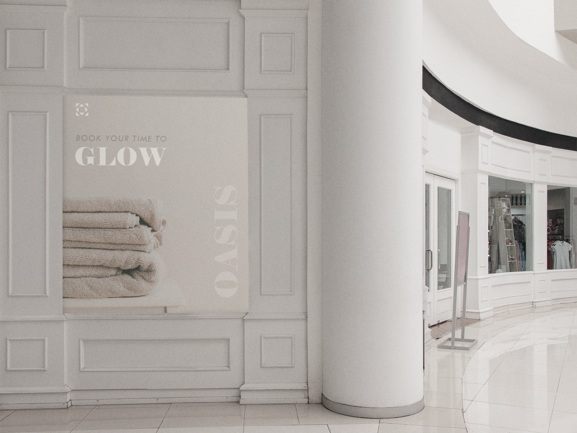
OASIS Spa & Wellness is a refined wellness brand designed to embody serenity, purity, and renewal. The visual identity captures the feeling of calm luxury - creating a space where relaxation meets design, and well-being becomes an experience of quiet sophistication.
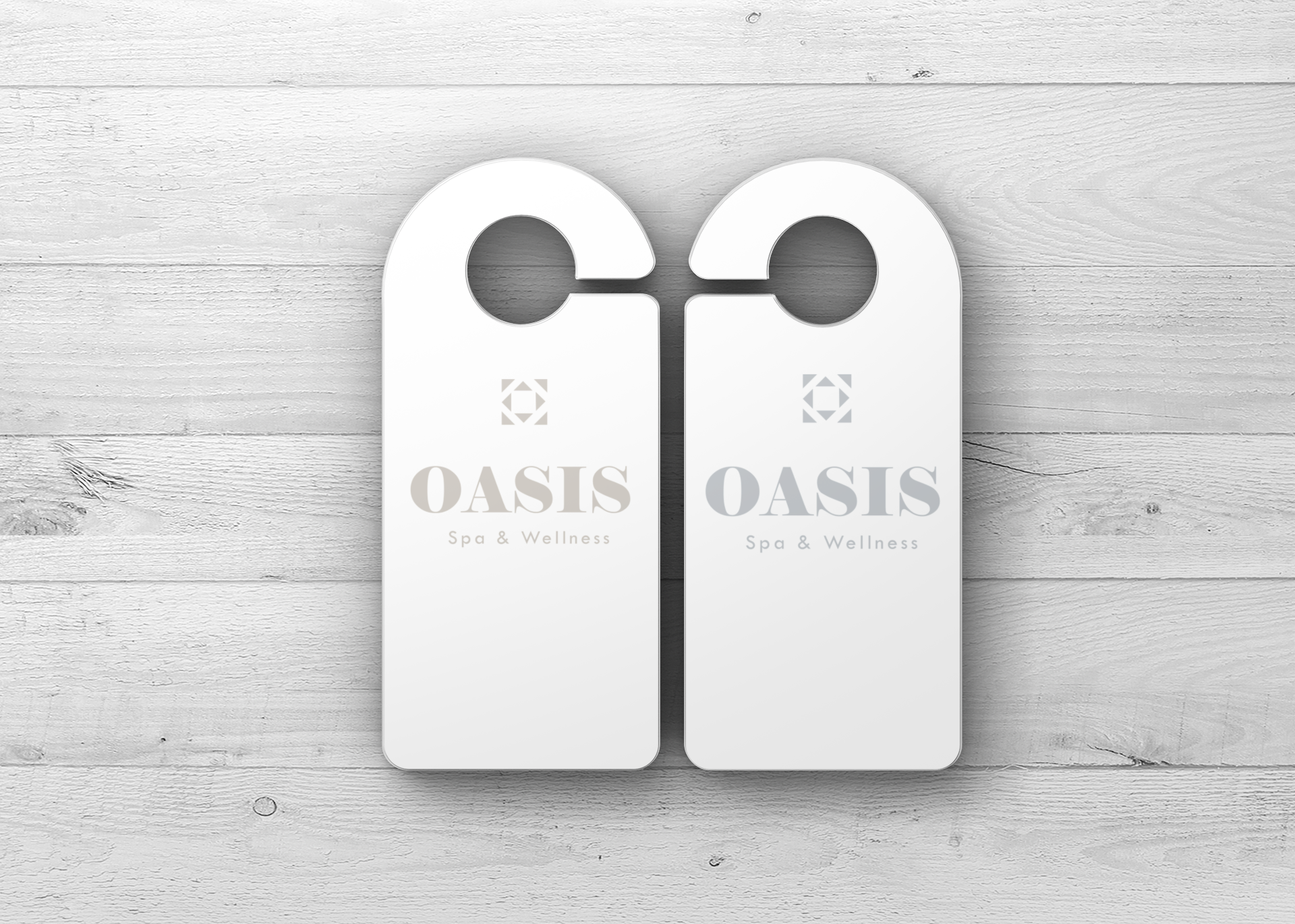
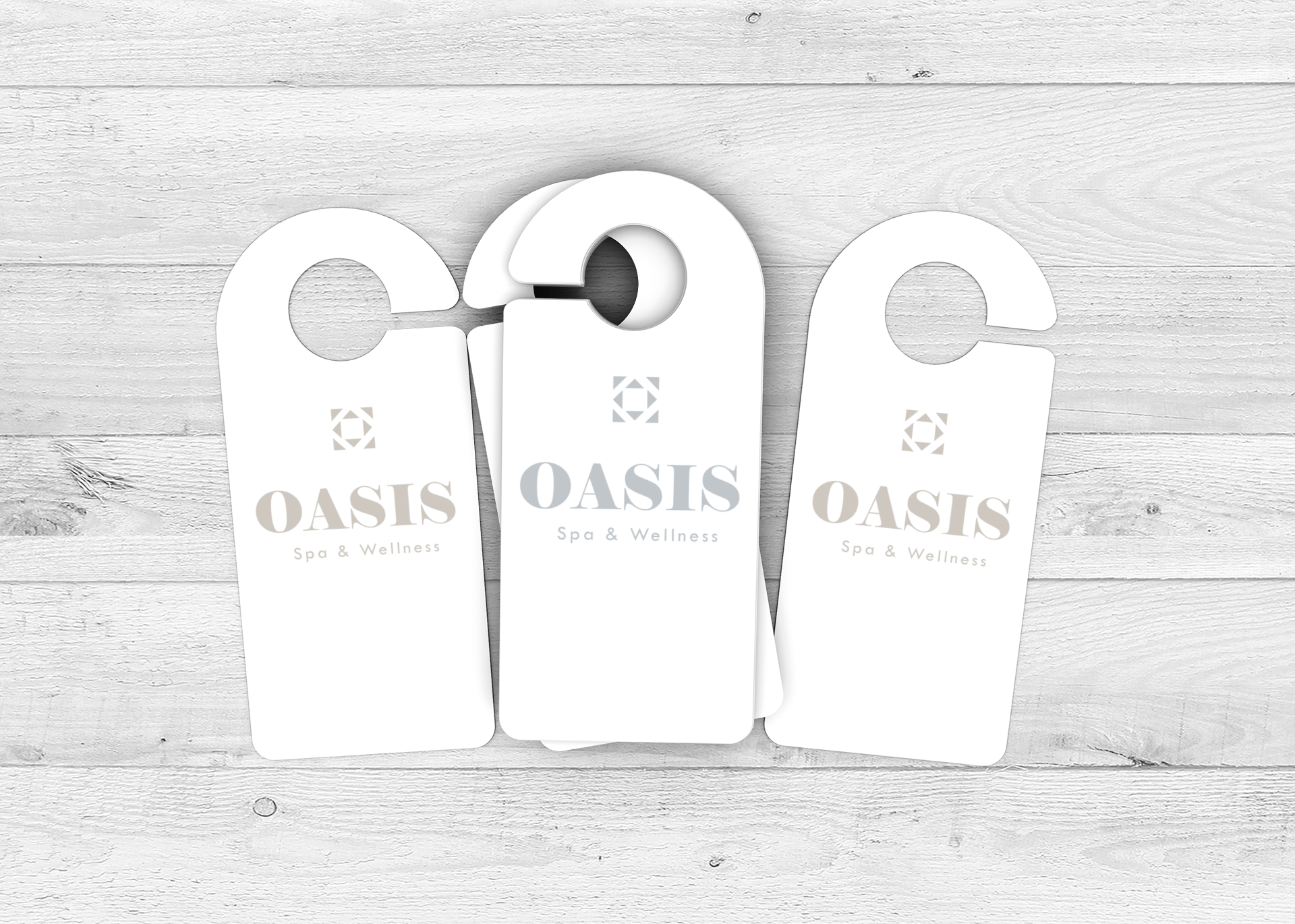
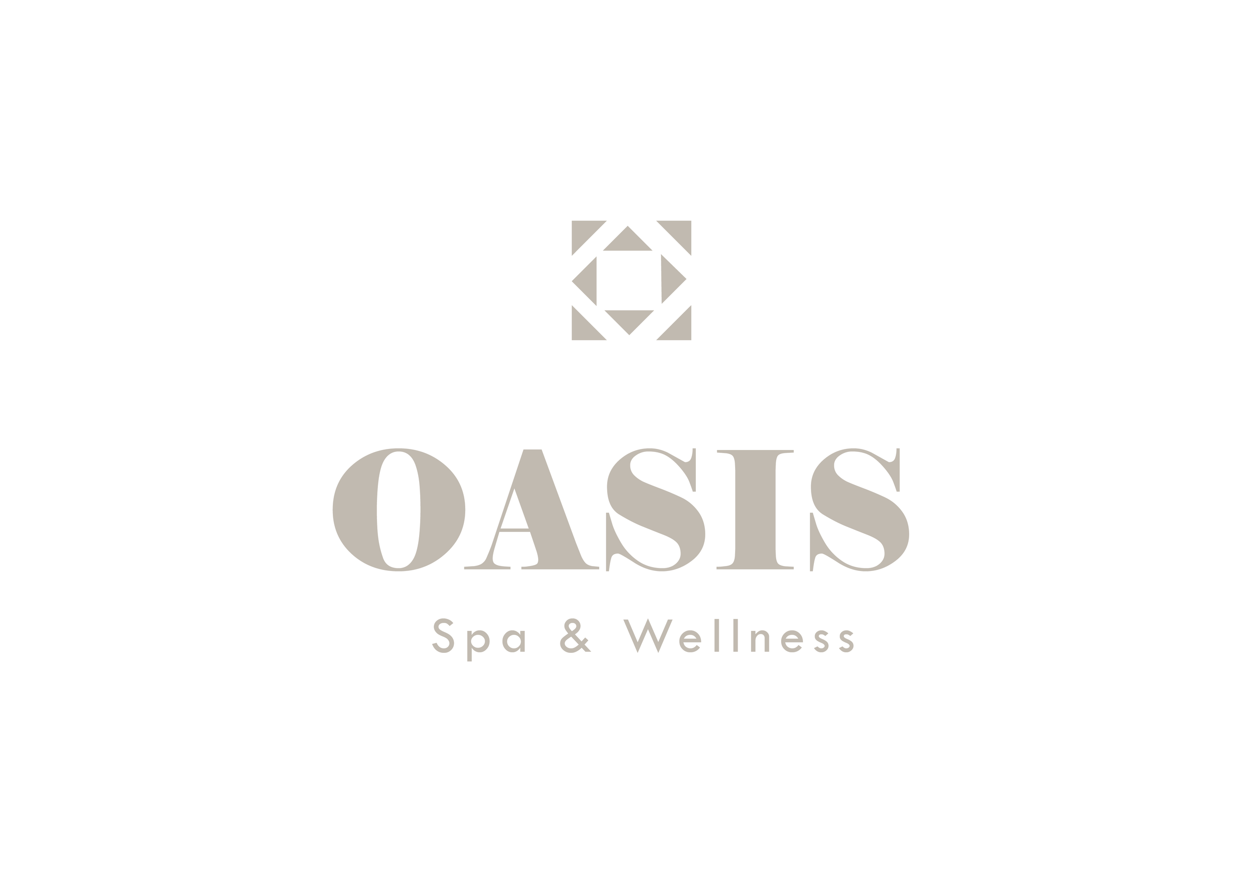
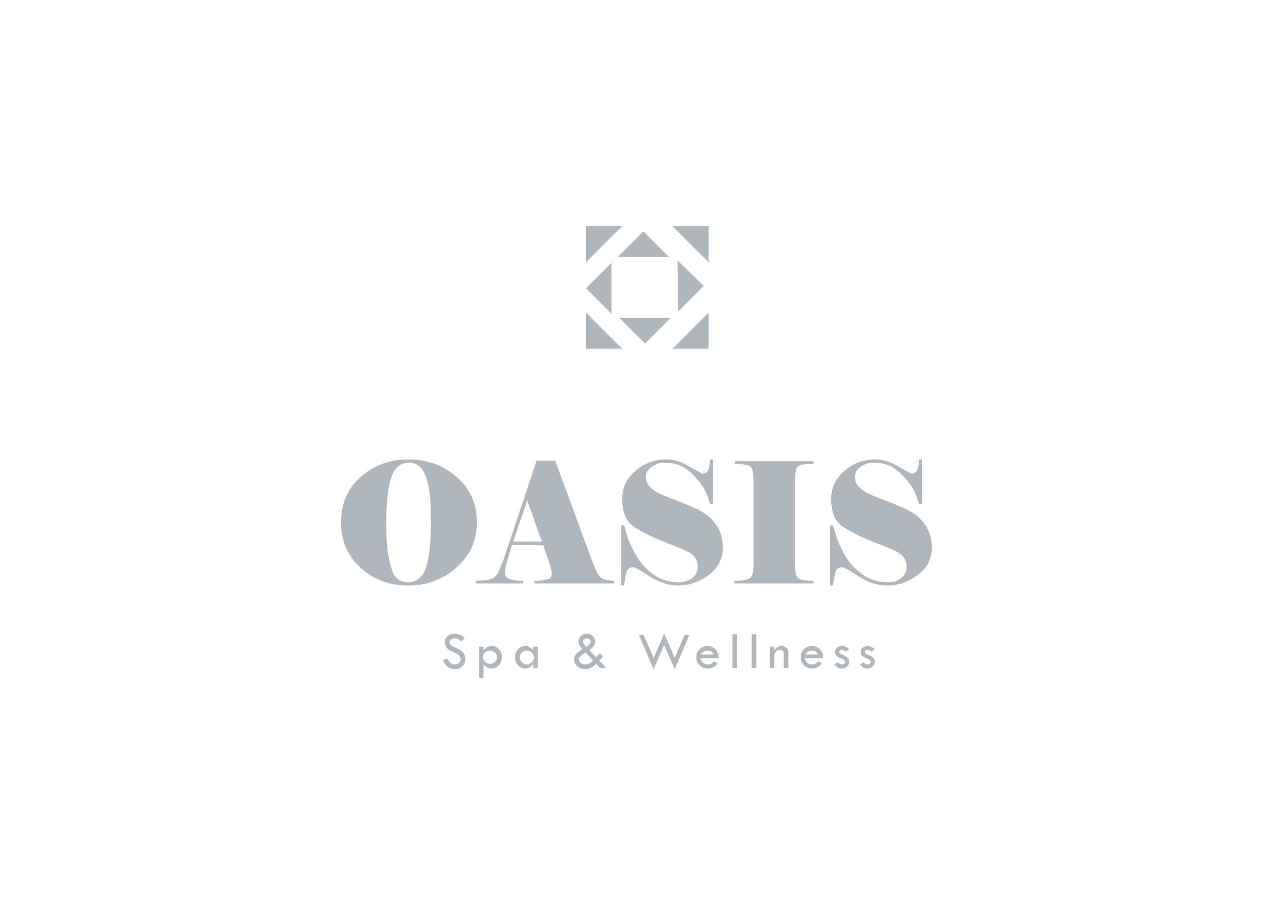
The logo concept is inspired by balance and harmony. Its geometric symbol suggests both structure and flow, echoing the essence of wellness: equilibrium between body and mind. Paired with elegant serif typography, the identity evokes softness and confidence at once.
Typography and color palette express the brand’s soothing atmosphere through soft neutrals, muted taupes, and shades of warm gray. The visual system was crafted to remain elegant and timeless across every touchpoint, from spa signage and printed materials to digital platforms and editorial layouts.
Core elements:
– Minimal geometric symbol representing balance and renewal
– Elegant serif typography with modern refinement
– Soft, neutral color palette inspired by natural textures
– Cohesive visual system across print, interior, and digital applications
The result is a serene, sophisticated brand identity that transforms OASIS into more than a spa, a visual and emotional sanctuary for relaxation and rejuvenation.