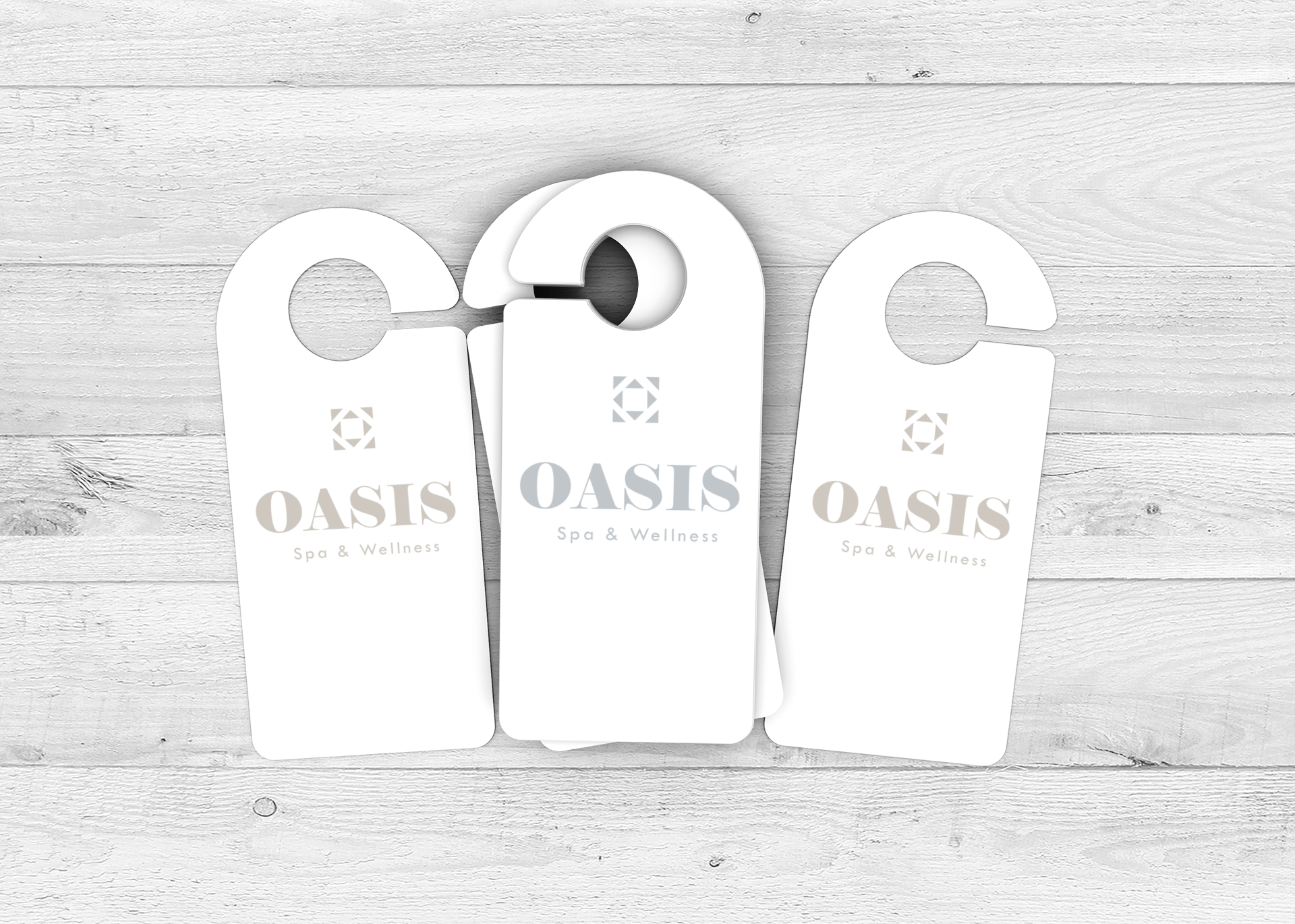
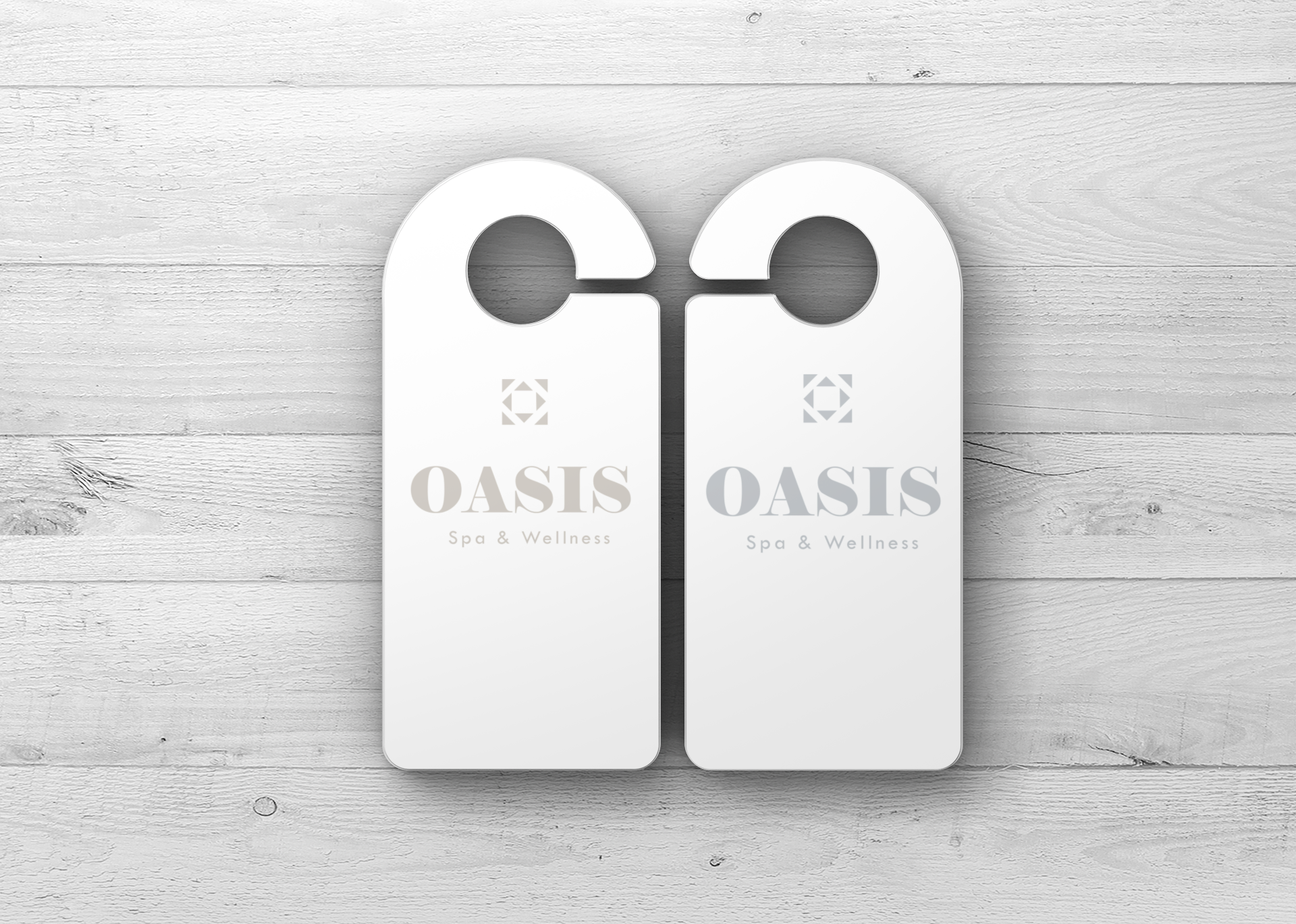
OASIS Spa & Wellness
Brand Identity | Print Collateral | Editorial Design
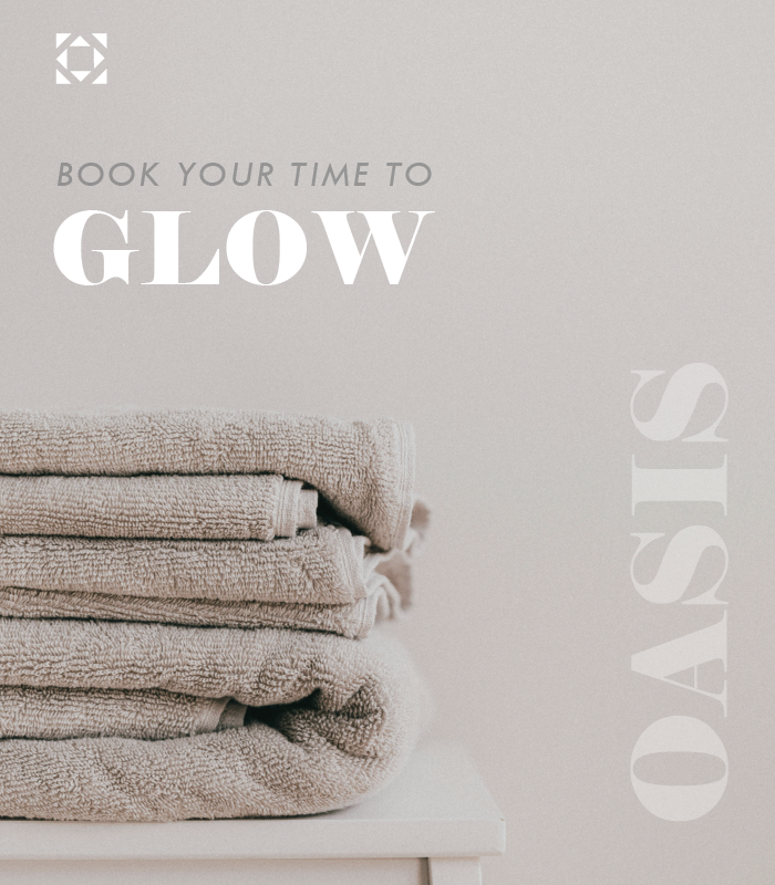
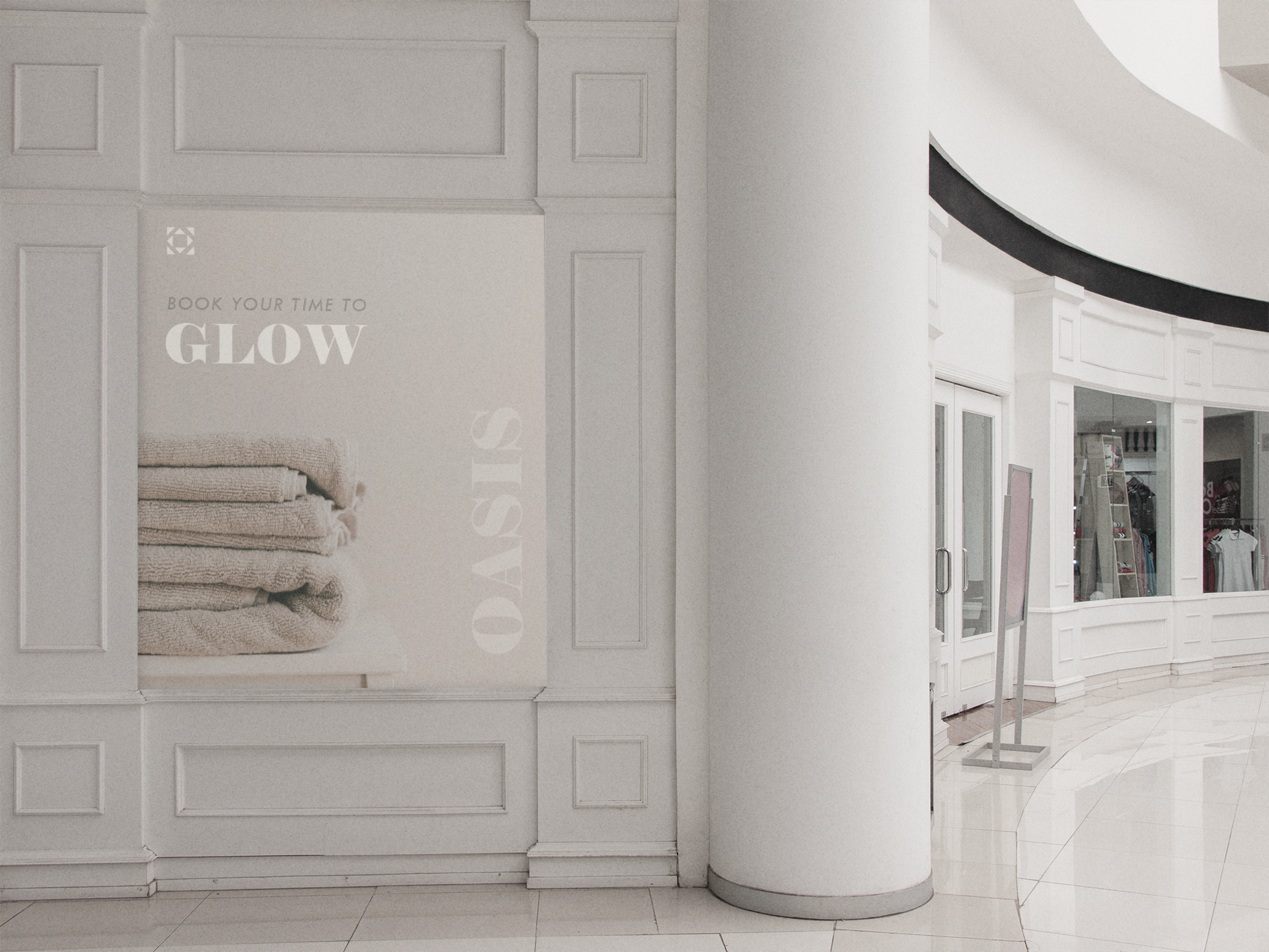
OASIS was envisioned as more than a spa — it is a visual and sensory escape from overstimulation. My goal was to translate this feeling of balance, warmth, and stillness into a cohesive brand identity that feels luxurious, grounded, and effortlessly calming.
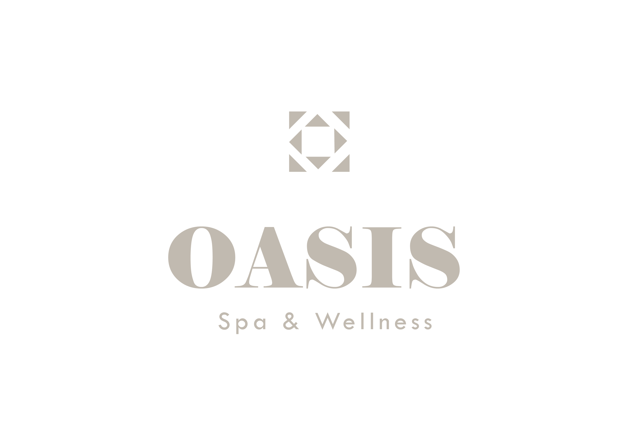
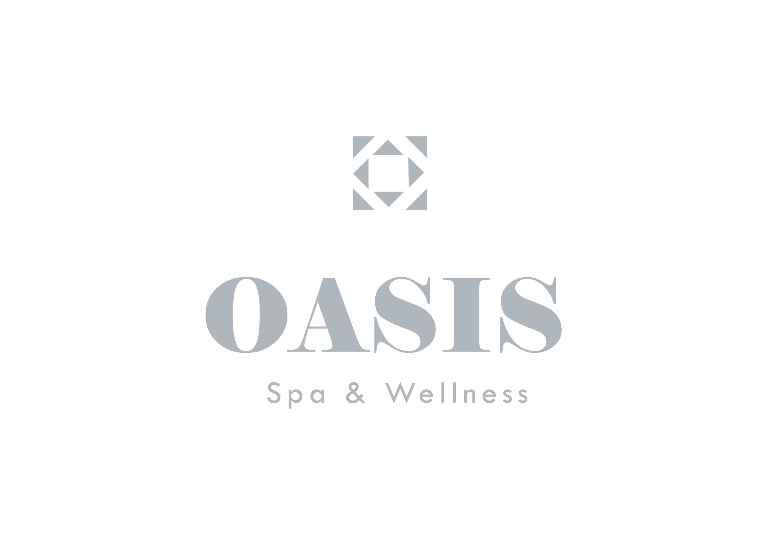
A muted, mineral-inspired palette was chosen to reflect natural textures and an earthy calm: Clay Taupe ,Limestone Grey ,Pale Fog ,Slate Blue-Grey ,Ecru White.
An editorial mix of sculptural serif headlines and light sans-serif body text gives the identity rhythm and elegance. The typography feels luxurious without shouting .OASIS is a brand that speaks softly but leaves a lasting impression. The identity is not just designed to be seen — it’s made to be felt.