LION Golf Club
Brand Identity | Merchandise | Campaign Visuals
LION Golf Club needed a brand identity that would reflect both its refined character and modern appeal. The design challenge was to create a visual system that felt exclusive, yet approachable — classic, yet distinct in a competitive luxury sports market.
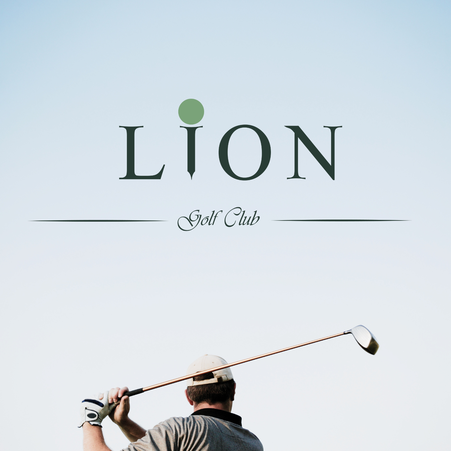
The brand’s core lies in the clever reinterpretation of the letter "I" as a golf tee and ball — transforming a single glyph into an iconic, instantly recognizable mark. This subtle visual metaphor connects the name "LION" with the sport without relying on clichés, creating a confident and minimal logo that appeals to both seasoned players and younger audiences.
These tones balance heritage with modernity, allowing the brand to feel classic yet contemporary across all applications.
A custom serif typeface gives the wordmark authority and grace, while small stylistic flares (like the dot and tee in the "I") introduce personality without disrupting the elegant tone.